The British automaker is repositioning itself as an ultra-luxury EV brand, and the new direction is accompanied by a fresh set of badges for future Jaguars.

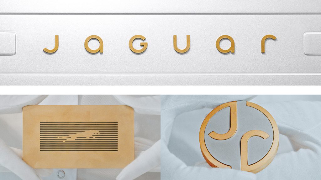
Jaguar has unveiled fresh logos and designs as part of its shift to become a high-end luxury electric vehicle brand, aiming to rival Rolls-Royce and Bentley. The new “leaper” logo takes inspiration from the classic Jaguar hood ornament, but with a modern, sharper look. The updated design also features a sleek “strikethrough” backdrop. Additionally, a new custom typeface mixes uppercase and lowercase letters, and a round badge showcasing the letters “J” and “r” completes the refined look.
Jaguar is reinventing itself. The British carmaker is slimming down its offerings, with only the F-Pace SUV remaining for 2025, while preparing to launch a new luxury electric vehicle lineup. To mark this change, Jaguar has introduced fresh logos and a bold new design direction.
The updated emblems, revealed at Jaguar’s headquarters in Gaydon, England, signal a shift toward a more high-end, modern look. Jaguar describes the new designs as “exuberant, modernist, and compelling,” and says it’s ready to challenge traditional expectations with this bold new approach. Fans of the brand might find these changes controversial, but Jaguar is embracing the idea of standing out.
Jaguar’s new look has four key elements: two logos, a modern typeface, a fresh color palette, and a graphic style called “strikethrough.”
The new typeface is sleek and modern, with the word “Jaguar” written in a mix of uppercase and lowercase letters, often shown in gold on a clean white background made up of horizontal rectangles.
The “strikethrough” graphic style uses horizontal lines within a rectangular border, creating a bold, contemporary vibe. This design also appears in Jaguar’s updated “leaper” logo, a modern, angular version of the classic jaguar mascot that once graced the hoods of their cars.
Jaguar has retired its iconic jaguar-face logo, which has graced the grilles of its cars for the past 20 years. In its place is a new circular badge featuring a sleek “J” and “r” in a brass color, linked to the curved border. This new emblem matches the modern typeface and exudes a clean, refined look.
To complement the bold new logos, Jaguar is introducing a vibrant color palette inspired by primary colors—red, blue, and yellow. This palette reflects the brand’s commitment to “exuberance” and adds a lively touch to its refreshed identity.
Jaguar is simplifying the car-buying process with a redesigned website, though U.S. customers will still need to complete their purchases in person. The website will kick off a new digital experience, including a phone app that helps owners manage their cars and schedule maintenance. Jaguar will continue supporting current owners of its existing vehicles.
The brand is also opening a select number of luxury stores in high-end districts like Paris, alongside brands like Gucci and Moncler. These stores will act as brand hubs, offering a mix of retail and experience spaces. With fewer dealerships—down from 200 to 122 in the U.S.—Jaguar is focusing on a more direct, exclusive approach.
While many details about Jaguar’s new electric vehicles remain under wraps, the new logos and designs signal a bold step toward the future. In just two weeks, we’ll get a first look at a new car that marks the beginning of this exciting new chapter.

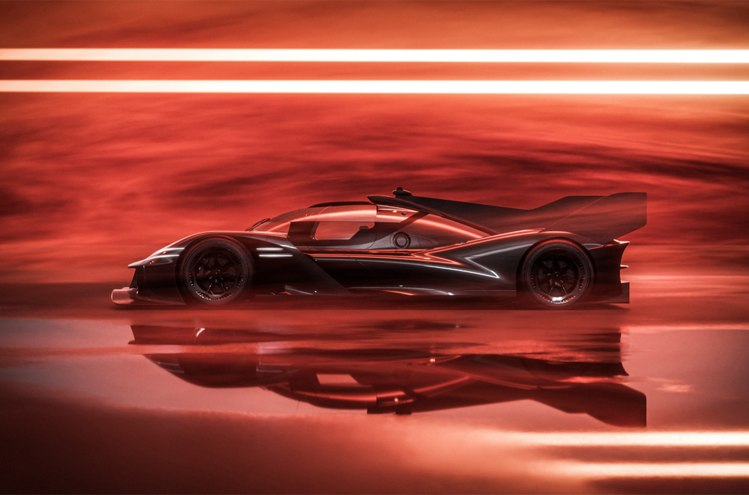
The streets of Dubai, a playground for the world’s most opulent automobiles, r
Read More

The automotive equivalent of a rookie challenging Muhammad Ali: Genesis has thro
Read More

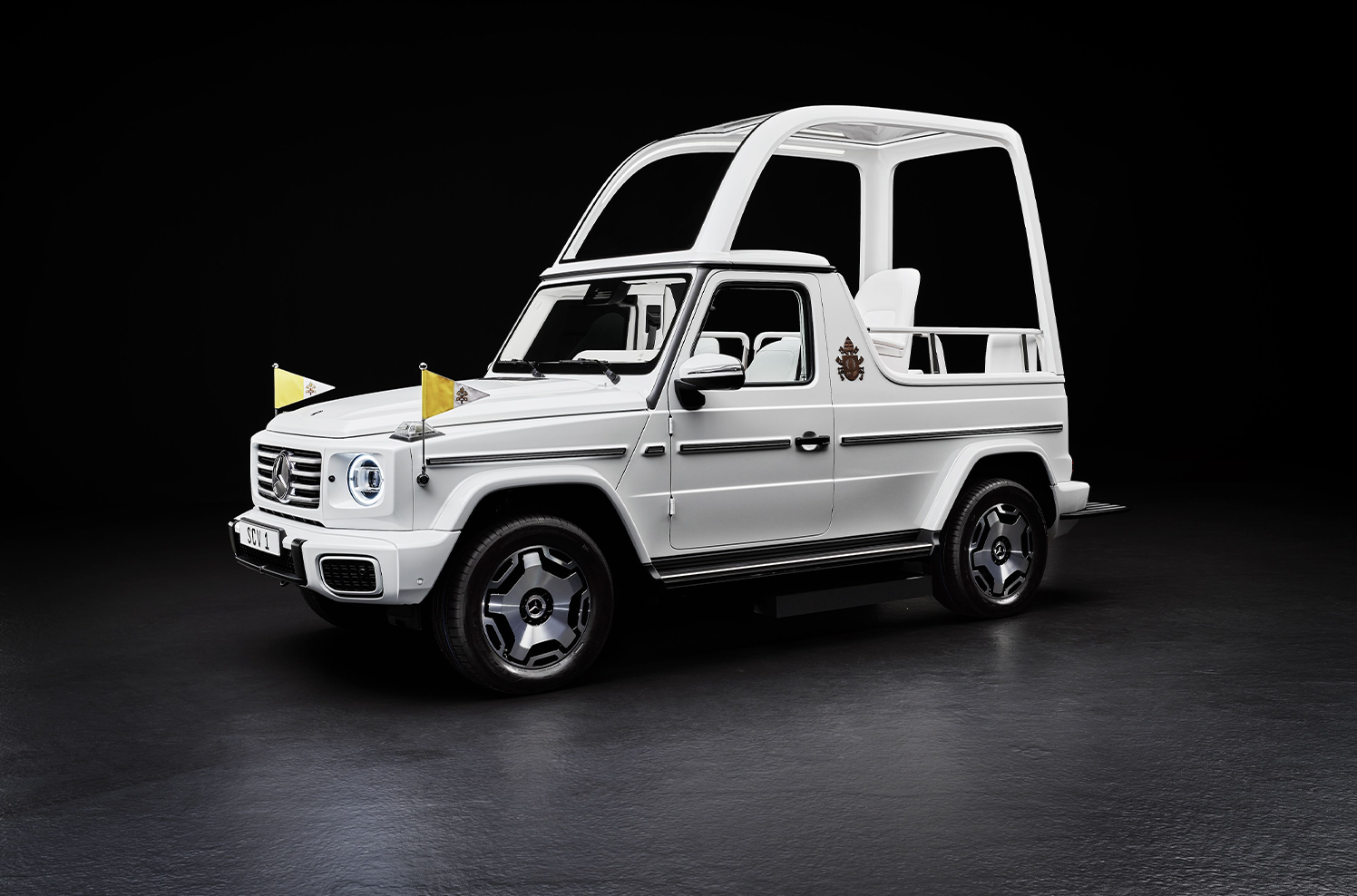
The latest iteration of the Popemobile—the Holy Father's main form of transpor
Read More

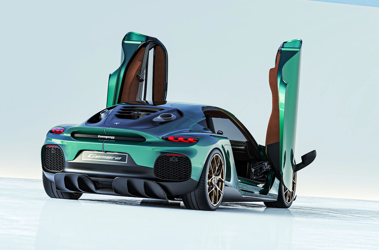
The production version of Koenigsegg's four-seat supercar will offer a 5.0-liter
Read More


